Athan By IslamicFinder
Redesigning the prayer tracking
experience to improve
user engagement
MY ROLE
- UI Design
- UX Design
- Illustration
- User Interviews
- Wireframing
- User Flows
Team
- 1 Product Manager
- 1 Designer
- 1 Full Stack Dev
I am text block. Click edit button to change this text. Lorem ipsum dolor sit amet, consectetur adipiscing elit. Ut elit tellus, luctus nec ullamcorper mattis, pulvinar dapibus leo.
PLATFORMS
- Android and iOS
YEAR
- 2020
WHAT IS ATHAN?
Athan is a prayer tracking app that helps Muslims keep a log of their daily five obligational prayers through a checklist.
The ‘checking stuff off’ experience is specifically redesigned to be very visual and illustrative. I’ll explain why further down in the case study.
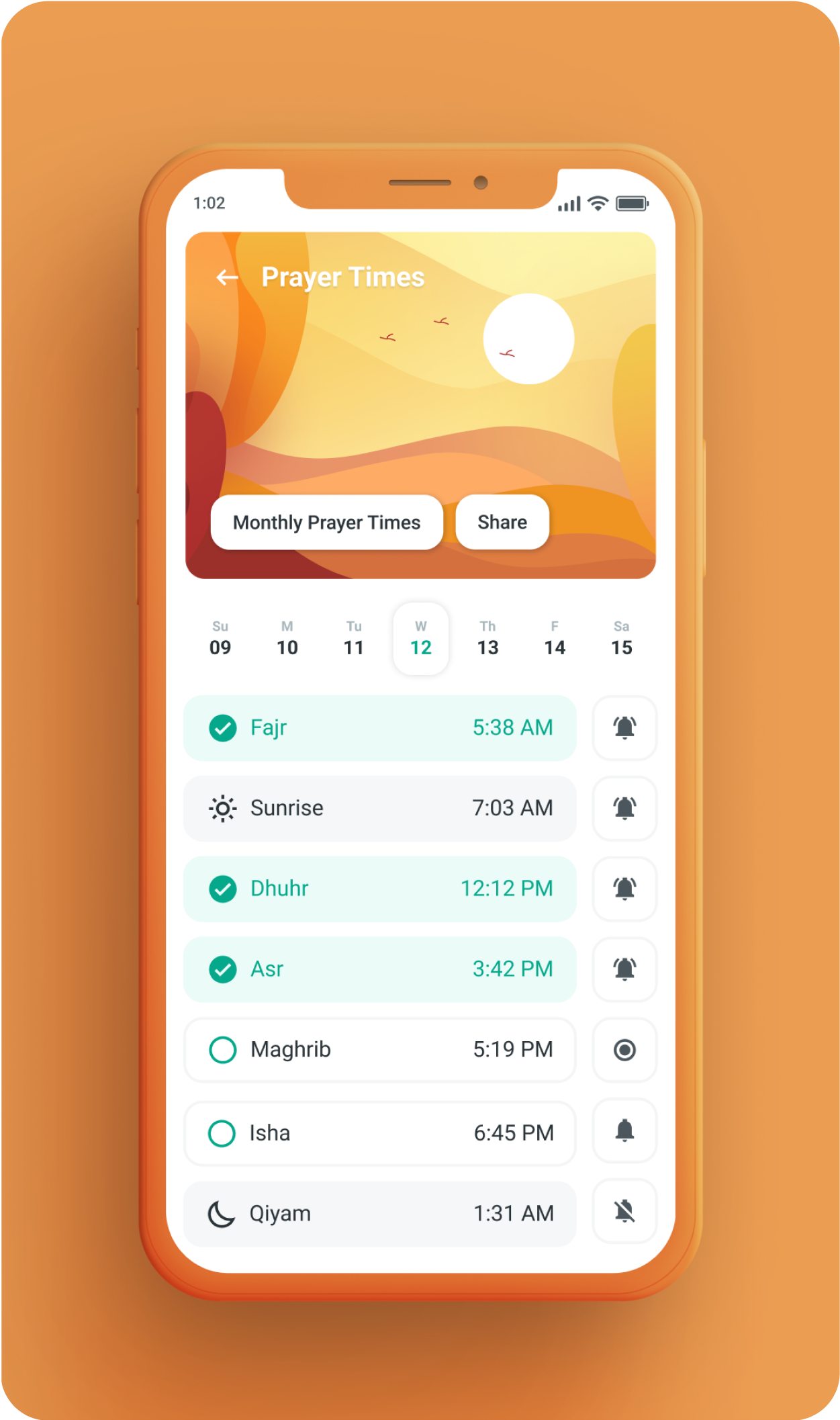
Illustrations change depending on the time of the day a user opens the app. Depicting a sunrise during the day. A moonlit sky at night.
Key
Drivers
We were aiming to help users visualize their daily spiritual progress and rewards so they can end their day feeling fulfilled.
SO WE REDESIGNED THE PRAYER TRACKING EXPERIENCE
Through user interviews we discovered that a percentage of our users were offering their daily prayers but not logging all of them into their prayer tracking app. While there was also a good percentage that was logging all of their prayers. Our objective was to convert the former users into the latter.


User
Objective
A percentage of users was offering more prayers than they were logging. We targeted this subset of users in order to encourage them to log all of their offered prayers.
INCREASING APP ENGAGEMENT THROUGH VISUAL DELIGHT
Human’s are very visual focused beings. A key way to trigger emotions and get them to pay attention is through visuals. We made the existing prayer logging experience more visual centric to make it more emotion driven. For this I added visual cues that helped users visualize the feeling of fulfillment they would get by offering a prayer. All of the visual elements added to the app were geared towards magnifying the emotional aspect of spiritual fulfillment.
Business
Objective
INCREASING USER RETENTION THROUGH GAMIFICATION
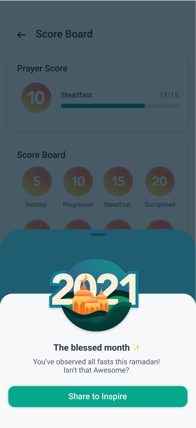
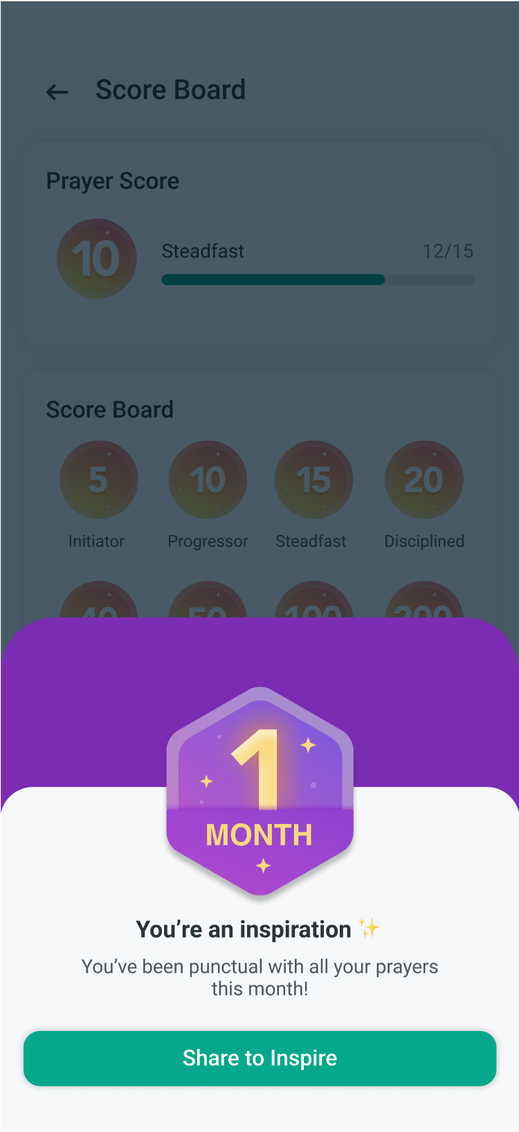
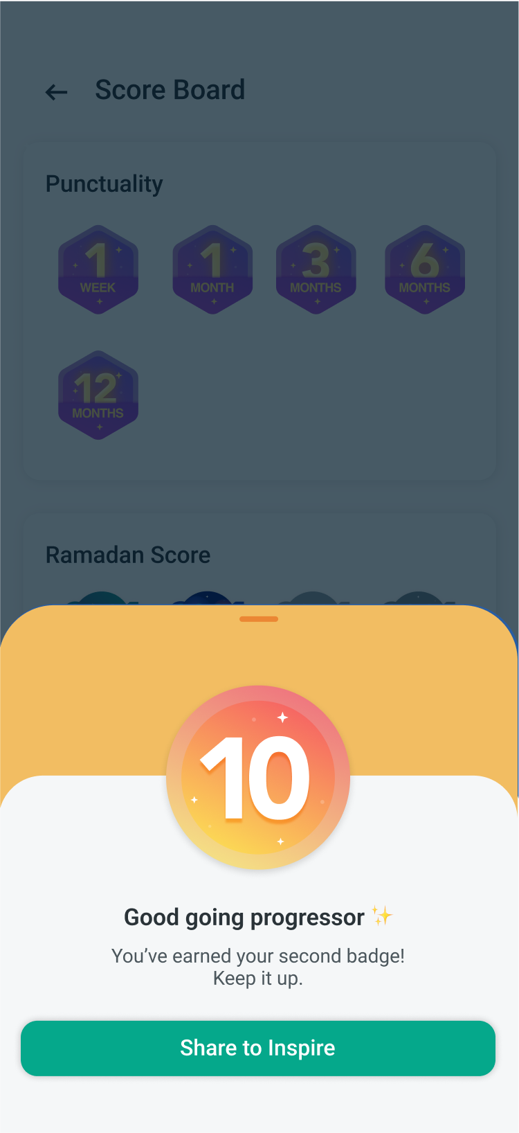
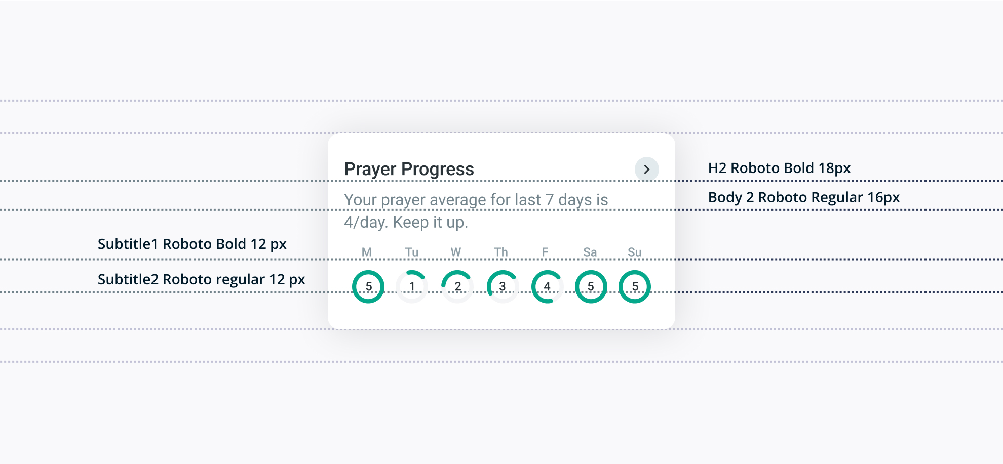
A major objective of the redesign was to help users view and keep a visual record of their prayers timeline. This visual history was designed as a tool of encouragement and motivation. It would encourage them to build on top of it. It’s easier to continue from a previous record than start from scratch hence the history would be instrumental in helping users get over beginners inertia. For this we introduced progress indicators with increasing brackets of time (Day, Week, Month, Year) at multiple touch-points in the app.
We also introduced a system for immediate bite sized feedback and nudges at various steps so the user remains motivated. Progress indicators and scale appropriate affirmations were added at the smallest steps so the user gets a sense of achievement and remains motivated.

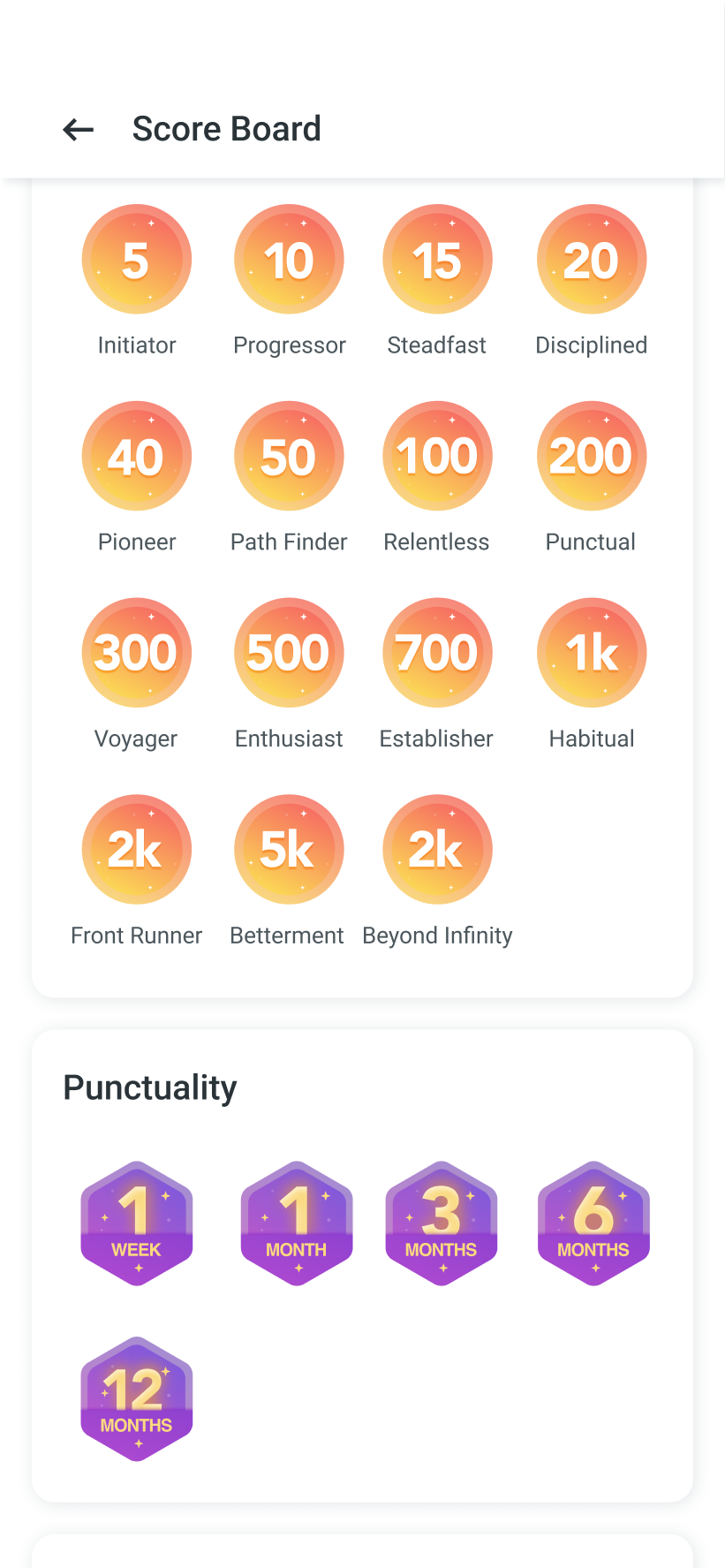
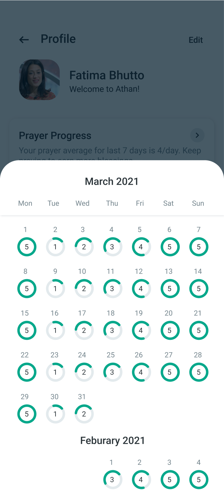
Progress indicators at various touch-points in the App. All designed to be visible and accessible at any point.
Design
Language
Setting up a basic, functional type and color system was pivotal to the speed with which we designed. Having a system helped us move fast and squeeze in more iterations in given time.
I started building on top of Athan’s legacy color palette. I edited some of the existing colors, added some colors to it and came up with a fresh looking set of colors. This way the palette remained cohesive with the rest of the application while also becoming modern.


Grey
I edited the existing pure greys to blue greys so that they were harmonious with the blue-greens of the palette. The greys were mostly used in backgrounds, inactive elements and text. They helped in establishing a content hierarchy throughout the application.
House Colors
These were the colors that were already part of the application. I added some shades and hues of the same colors and edited some of these by adjusting lightness and saturation for establishing color harmony.
New Colors
Added to the existing palette to accommodate the feature expansion and redesign.
Typography
Typogra
phy
DEVELOPING A TYPESCALE
Multiple calendars and their variants needed to be designed. Some were redesigned others designed from scratch. We had to maintain content hierarchy while working with multiple type based components. Documenting the existing type-scale, modifying it and then adding to it as I went helped us maintain consistency and keep the number of fonts weights and sizes used to a recommended minimum.

Learnings
WORKING WITH LEGACY DESIGN SYSTEMS
I was working with an existing and dated design language. Adding a new feature to a legacy application presents many constraint, Identifying which constraints to follow and which to break in order to integrate a new modern design into an existing application was a major challenge and hence a learning experience.
ILLUSTRATION
Another skill I got to polish here was illustration. I am not an illustrator although i can illustrate sometimes. Due to limited team members I had to take that role on and working on illustrations for the app helped me regain confidence in my illustration skills.
